Fern Quarterly
Client
Fern Society
Type
Editorial Design
Date
Introduction
A seasonal magazine exploring slow culture, design, and botanical arts needed an identity as reflective as its content. The commission was to develop both the visual system and editorial layout. The aim was a design that felt timeless, tactile, and aligned with its thoughtful tone.

Problem
The magazine lacked a structure that could balance essays, interviews, and imagery. Without cohesion, the reading experience felt fragmented. Fern Society needed a framework that could grow with future issues.

Solution
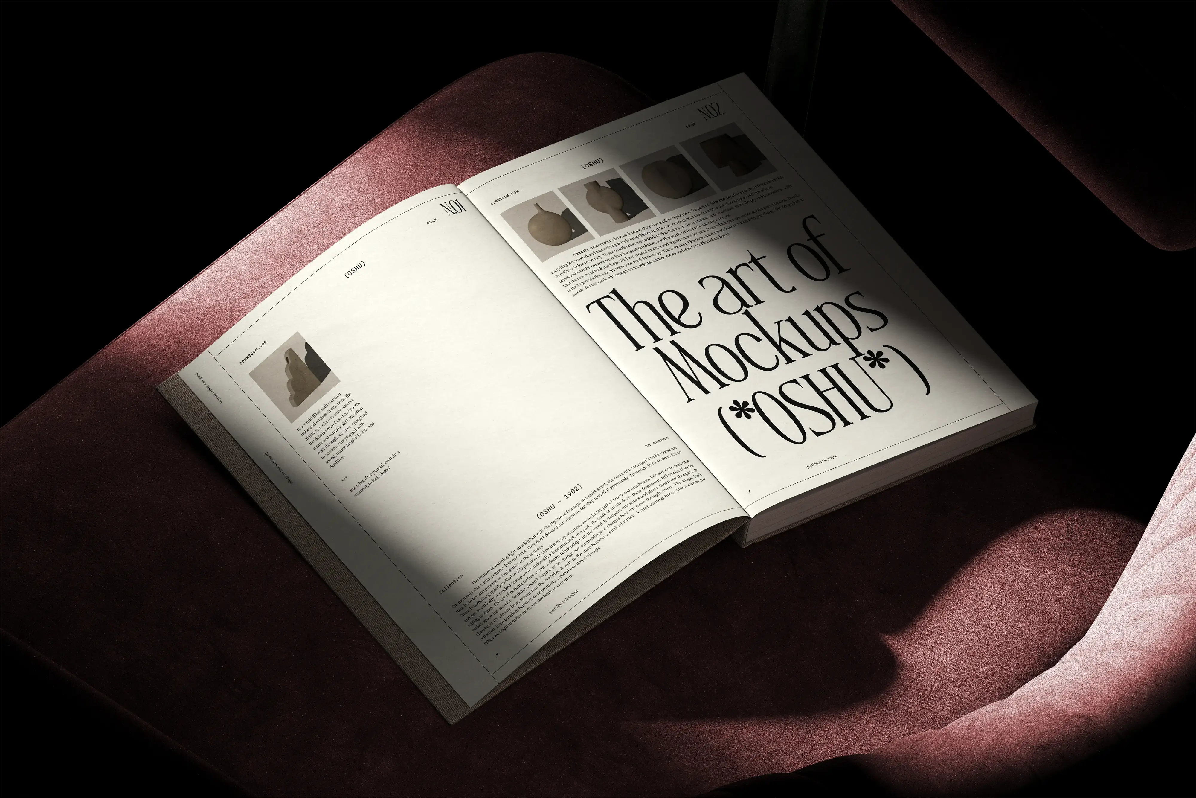
We created a clean editorial grid supported by elegant typography and organic details. The system gave space for both text and imagery to breathe. This approach allowed Fern Quarterly to feel consistent while keeping its reflective character.
Visual Credits:
Some images in this template are the work of their original creators. Full credit belongs to them. These are for demo use only. Please replace them with your own images.